A few weeks ago we began our series of eight easy changes that you can make to your website right now to start driving more leads, increasing sales, and growing your business! Every tip is easy to implement and should help you increase leads and minimize lost opportunities.
Before reading today’s tip, we recommend checking out the first two tips in the series:
Alrighty then, now that you’re all caught-up, let’s get into the week 3 tip!
Add A Call-To-Action:
So you’ve got an awesome product that your customers love, your tagline is spot-on, and your website visitors understand how and why they should do business with you.
So, why aren’t you getting more sales?
If your site is like a lot of websites out there, it’s probably because you’re not asking your customers to buy.
Simply Put:
If your customers don’t know how to do business with you, they won’t do business with you.
That’s where your Call-To-Action (CTA) comes into play.
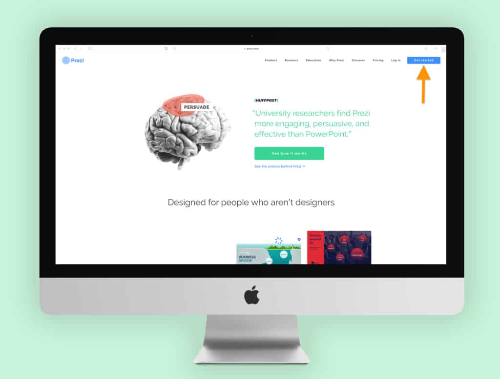
If you haven’t done so already, you need to add an obvious, eye-catching, and high-contrast CTA button to your website.
The CTA button is how you ask the customer to place an order, buy your widget, book an appointment, or request a quote… it’s your website’s main way to drive revenue.
If you sell a product, your CTA button should request that your customer “buy now” or “shop now” for eCommerce sites.
Your website’s call-to-action should take front stage, it should be featured on every page, it needs to be top-of-mind.
Your website’s calls-to-action should be strong and confident, featuring phrases like “Buy Now”, “Get a Quote”, or “Schedule an Appointment”.
Avoid weak phrases like “Let’s Chat” or “Learn More.” It’s human nature to feel more comfortable using weak CTA’s to avoid being seen as too “sales-y” but they aren’t strong enough to really help drive leads.
When choosing the language for your call-to-action remember three things:
- People are generally complacent by nature and need to be compelled to buy what you’re selling.
- You need to show confidence to prove that your customer needs to purchase your product or service.
- If you’re not confident in asking your visitors to buy, then why should they feel confident that your product is right for them?
So what are you waiting for? Add a high-contrast CTA button to the upper-right of every page of your website today!
And check back here next week for another tip.
Take Action
Are you driving more leads with your new CTA and want to improve your site even more?
Optimizing websites is what we do. From driving more clicks to creating up-worthy content, we’re here to help you and your business to succeed.
Want to learn how we can help grow your business, request a quote today!


