Remember when Papyrus was “the” font?
Even if you don’t know it by name, trust me, you’ve seen it. Logos and packaging seem especially vulnerable to this ubiquitous typeface now only associated with amateur design.
Coffee shops, patchouli-scented candles, yoga studios and small-batch-organic-free-range-lotions all proclaim their “naturalness” in this clichéd, pre-distressed font.
Of course, at one point, Papyrus was novel. Might I even venture, cool? But now, even Christ Costello, the designer responsible for the font, admits the font has become “diluted and lost its original appeal.” 1
The over-saturation of Papyrus led to its cringe-inducing infamy, and I wonder if the same will happen to another font — one I’ve been seeing more and more every day.
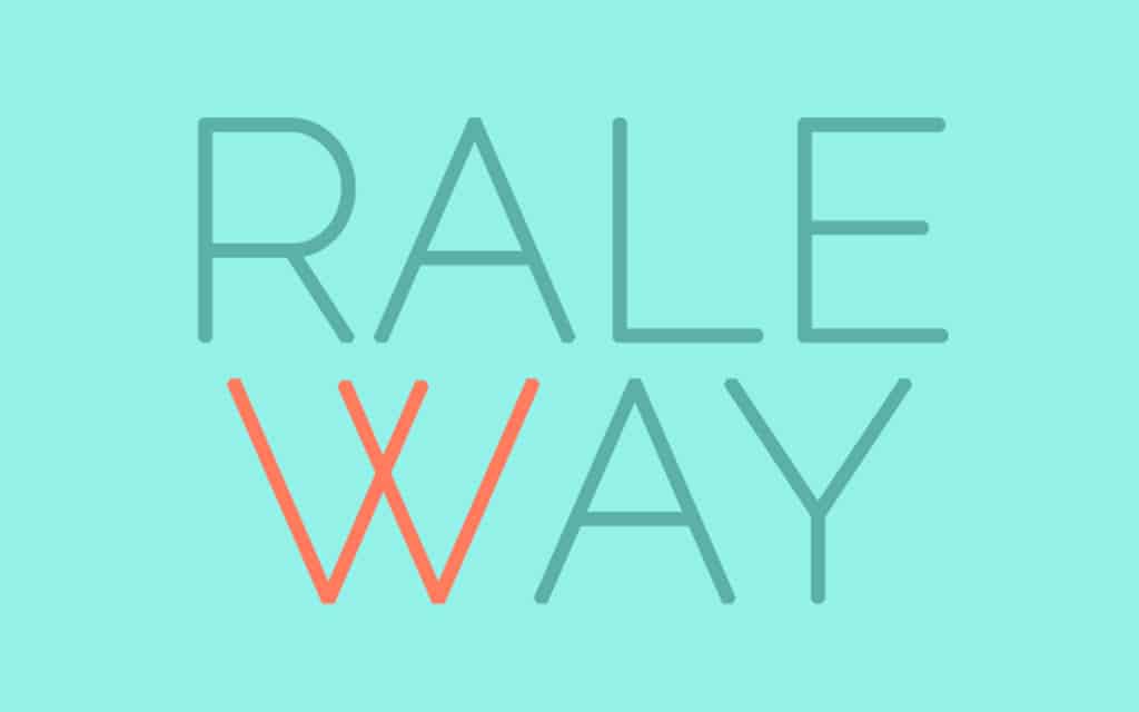
Enter Raleway.
Designed five years ago, this san-serif font is beautiful. It’s thin, well proportioned, chock full of useful glyphs, and — unfortunately — on the verge of being completely overused.
If you still can’t picture it, let me help. Next time you’re perusing a seemingly new website, look closer at the font. See that w? Yeah, that one. With the geometric lines and the uniquely crossing v’s. That’s Raleway.
Just as Top 40 radio stations make you hate songs you used to enjoy, (I’m looking at you, every Avicii song ever) so do I predict my eventual distain for Raleway.
The font is available as an open-source web font and designed to complement clean, elegant layouts, which apparently means that every trendy website design theme available needs to feature it in their demo.
Perhaps you’ve found yourself contemplating this delicious default font in your editor. I ask of you this: Resist the temptation. Change the font. Or see yourself among those living a life of font-regret. Just ask any ex-Papyrus user, it’s a dark place.
1 http://www.boiseweekly.com/gyrobase/Content?oid=oid%3A314974


